
23 July, 2024
The Vibrant World of Colour Psychology in Drink Bottle Branding
Welcome colour enthusiasts and hydration heroes! Today, we are looking into a topic that's as colourful as a Melbourne laneway mural – the fascinating world of colour psychology in drink bottle branding. It's a story of how brands use colours to not just catch your eye, but also to whisper sweet nothings to your brain, making you reach for that bottle.
The Rainbow Connection – Why Colour Matters
Before we splash into the deep end, let's paddle in the shallows of why colour is such a big deal in branding. Colours are like silent megaphones; they shout messages without making a sound. They can make you feel energetic, calm, hungry, or even thirsty! When it comes to drink bottles, colours are not just about looking pretty; they're about creating a mood, an emotion, and an unspoken promise.
The Psychology of Colours – What Each Hue Tells You
Let's colour outside the lines a bit more and explore the deeper shades of meaning behind each hue.
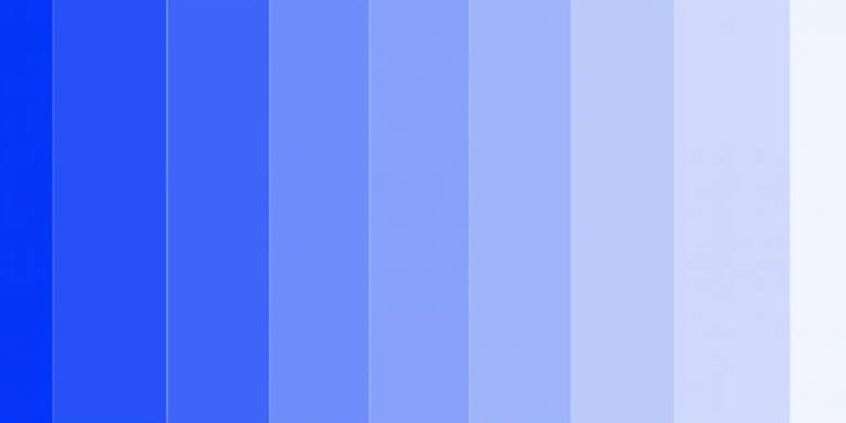
Blue: The Cool Oasis
Blue isn't just a colour; it's a mini-holiday for your mind. It's the colour of the sky on a clear day, the ocean in all its vastness. In the world of drink bottles, blue stands as a beacon of hydration. It's like it's saying, "Relax, take a deep breath, and hydrate." It's no wonder that blue is often chosen for water filters and mineral water bottles – it's the universal sign for clean, pure, thirst-quenching H2O.
Red: The Dynamic Daredevil
Red is more than just a colour; it's an adrenaline rush in visual form. It’s bold, it's fiery, and it speaks of courage and daring. For sports drinks and energy beverages, red is the go-to colour to signify power and performance. It's as if it is giving you a pep talk, urging you to push your limits and bring out the warrior within.
Green: The Nature's Whisper
Green is the heart of nature, symbolising balance, renewal, and harmony. When you see a green drink bottle, it's not just speaking to the eco-friendly crowd; it's whispering an invitation to reconnect with the natural world. It's the colour of choice for organic or plant-based drinks, hinting at health, wellness, and a lifestyle in sync with the environment.
Yellow and Orange: The Sunshine Duo
Yellow and orange, the dynamic duo of warmth and optimism. Yellow is like a burst of sunshine, evoking feelings of joy and energy. It's perfect for morning smoothies or breakfast drinks, offering a visual wake-up call. Orange, blending the energy of red and the happiness of yellow, is ideal for drinks that promise a zest for life and a boost of vitamin C. Together, they’re like a sunny day packed into a bottle, ready to brighten your mood and your day.
Purple: The Mystical Motivator
Purple is a colour that intrigues and inspires. It’s often associated with creativity, luxury, and a bit of mystical charm. In drink bottles, purple can signal a drink that’s not just a drink, but a potion of health, maybe packed with antioxidants or some superfood goodness. It’s for those who are looking for something a little out of the ordinary, a drink that promises to be as unique as they are.
Pink: The Playful Pal
Pink is fun, flirty, and full of life. It's a colour that can range from gentle pastel to neon vibrancy. It is often the choice for sweet, refreshing beverages. It's the colour that winks at you and says, "Hey, let's have some fun." Pink bottles are often targeted at a younger, trendier crowd, promising a drink that's as delightful and bubbly as their personality.
Black: The Sophisticated Statement
Black is sleek, it's chic, and it's undeniably sophisticated. It is the colour of choice for premium, luxury beverages. Think high-end mineral waters or specialty drinks. A black bottle doesn’t just say, “I’m a drink.” It says, “I’m an experience.” It’s for the discerning consumer who is looking for elegance and class in every sip.
Above is an entire spectrum of colours, each telling its own story, evoking its own emotion, and catering to its unique audience. Choosing the right colour is more than a matter of taste; it's about picking the hue that resonates with your personality and your hydration needs. Next time you one, think of the colour story it tells.
Shades and Tones – It’s Not Just About Colour
Let's not forget how shades and tones in drink bottle colours add their own twist to the tale. It's like a symphony, where each note contributes to the melody, making it richer and more nuanced.
The Lighter Side: Pastels and Brights
Pastel Hues: These soft, muted colours are like a gentle whisper compared to a shout. They bring a sense of calm, lightness, and purity. A pastel blue bottle, for instance, doesn't just say hydration; it speaks of tranquility, like a serene morning sky. Pastel pinks and greens suggest a soft, approachable product, perfect for health drinks or calming herbal infusions.
Bright Tones: Now, these are the life of the party! Bright tones are all about energy and playfulness. A bright yellow bottle is not just cheerful; it’s like a burst of sunshine in your hand, perfect for energy drinks or summer fruit infusions. Bright oranges and greens are great for attracting a younger, more dynamic crowd, suggesting a drink that’s not just healthy but also fun and full of life.
The Darker End: Deep Shades and Rich Tones
Deep Blues and Purples: These colours add an air of mystery and sophistication. A deep blue or purple bottle might be used for a high-end sports drink or a luxury water brand, suggesting quality and depth. It’s like wearing a classic, elegant dress or suit – it makes a statement of refinement.
Rich Reds and Burgundies: These are the colours of indulgence and intensity. They speak to a more mature audience, suggesting a drink that’s not just a quick refreshment but an experience to savour. Think of a rich red bottle for a premium energy drink or a sophisticated recovery beverage.
Neutral and Earthy Tones: The Subtle Sophisticates
Whites and Creams: These colours are all about simplicity and purity. A white or cream bottle can suggest a drink that’s clean, healthy, and straightforward – no frills, just pure hydration.
Browns and Greys: Earthy and grounded, these colours are perfect for organic or nature-based products. They communicate authenticity and a back-to-basics approach. They would be ideal for a minimalist, no-nonsense brand or might be used for an organic tea or a natural energy drink.
Metallics: The Glamorous Twist
Silvers and Golds: These aren’t just colours; they’re statements. Metallic tones can denote luxury and high-tech quality. A silver one might be used for a futuristic, high-performance drink, while gold could indicate a premium, limited-edition product.
Colour Trends – Riding the Wave of Popularity
Just like in fashion or interior design, colours in branding ride the waves of popularity, making a splash one season and then ebbing away for the next trend to roll in.
The Ever-Changing Tide of Colours
The Millennial Pink Wave: Ah, millennial pink – that soft, blush-tinged hue that swept through everything a few years back. In drink bottles, it represented a blend of modern chic and nostalgic warmth, appealing to a broad audience looking for something both trendy and comforting.
The Rise of Earthy Tones: Fast forward to today, and there's a shift towards nature. Earthy tones like olive green, terracotta, and sandy beige are riding the crest. These colours speak of sustainability, organic living, and a return to natural roots – perfect for brands wanting to convey an eco-friendly, wholesome image.
Forecasting Future Trends
Neon's Bright Comeback: Keep your sunnies ready, because neon might just be the next big wave. Neon colours are all about boldness and energy. They're like a bolt of lightning, perfect for sports drinks or innovative water filtration systems aiming to stand out on the shelves.
Pastels with a Twist: On the horizon, we might see a resurgence of pastels, but with a modern twist. Think pastel shades with metallic accents, combining softness with a touch of glamour, ideal for lifestyle drinks or fashion-forward hydration products.
The Role of Social Media in Colour Trends
Instagrammable Hues: In today's digital world, the 'Instagrammability' of a product can be a huge factor. Colours that pop in photos and look great in social media feeds can quickly become trendy. This phenomenon can drive the popularity of certain bottle colours that make for visually appealing posts.
Global Influences and Cultural Shifts
Cultural Colours: Sometimes, colour trends are influenced by global events or cultural shifts. For instance, during global sporting events, we might see a rise in national colours on drink bottles. Or, in times of societal focus on wellness, calming colours like blues and greens could become more popular.
Limited Editions and Seasonal Variations
Seasonal Shifts: Brands often release limited edition colours to align with seasons or special events. Think warm, cosy hues for autumn, bright, vibrant tones for summer, and festive colours for the holiday season.
Beyond Aesthetics – Colours That Do More
Colours can do more than just please the eye – they can play an active role in your hydration experience. In this innovative realm, colours aren't just about looks; they're functional, dynamic, and even a bit magical.
Temperature-Sensitive Colour Changing Bottles
Hydration Reminders: Imagine one that changes colour as the temperature of its contents shifts. Cold water might turn the bottle a vibrant blue, reminding you it's time for a refreshing sip. As the water warms to room temperature, the colour might fade or change, signalling it's time for a refill.
Interactive Experience: These ones add an element of fun and interaction to hydration. It's not just a drink; it's a visual experience that can be particularly appealing to kids (and let's be honest, adults too) who might need that extra nudge to stay hydrated.
Colours That Evoke Physical Responses
Feeling More Hydrated: Some colours, like cool blues and greens, can actually make you feel more hydrated. A bottle in these hues might make each sip seem more refreshing and satisfying, especially on a hot day.
Energising Hues: On the flip side, warmer colours like reds and oranges can create a sense of energy and revitalisation. A bright red one might be just the thing to motivate you to drink more during a workout, giving you that psychological boost to keep going.
Mood-Enhancing Colours
Calming Pastels: Soft pastels can have a calming effect. One in gentle lavender or soft mint green can be a soothing presence on your desk, subtly encouraging you to take regular sips and keep calm and hydrated throughout the day.
Bright Colours for a Happy Boost: Vivid yellows and playful pinks can lift your mood. One in these cheerful colours can be a small but effective way to bring a bit of joy to your daily hydration routine.
Smart Bottles with LED Colour Indicators
Technology Meets Hydration: Some high-tech bottles now come with LED indicators that change colour based on your hydration goals. They might glow green when you’re on track, yellow as a gentle reminder, and red if you're falling behind on your water intake.
Personalised Hydration: These smart bottles can often be customised to your personal hydration needs, making them an excellent tool for athletes, health-conscious individuals, or anyone looking to up their water intake in a fun and tech-savvy way.
Conclusion: A Spectrum of Choices
So, there you have it – a whirlwind tour of the vibrant world of colour psychology in drink bottle branding. It’s more than just picking a colour; it's about understanding the whispers of each hue and what it means to you and the brand. Next time you pick one, think about the colours and what they’re saying. It's a fun way to add a splash of colour to your daily hydration routine!
The Drink Bottles Team